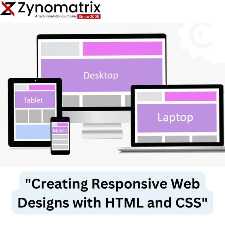
"Creating Responsive Web Designs with HTML and CSS"
"Unlock the power of responsive web design with HTML and CSS. Learn the principles and techniques to craft websites that adapt gracefully to various screen sizes and devices. Elevate user experiences and stay ahead in the ever-evolving digital landscape." This meta description provides a concise summary of your blog post's content and encourages users to click and learn more about creating responsive web designs with HTML and CSS.

Introduction:
In today's digital landscape, web users access websites on a wide range of devices, from desktop computers and laptops to smartphones and tablets. To deliver a consistent and user-friendly experience across these devices, creating responsive web designs has become essential. In this blog post, we'll explore the principles and techniques of building responsive web designs using HTML and CSS.
Understanding Responsive Web Design:
Responsive web design is an approach that ensures a website's layout and content adapt seamlessly to the screen size and orientation of the device being used. It eliminates the need for separate mobile and desktop versions of a site and provides a unified user experience. To achieve this, we rely on HTML and CSS to create flexible and adaptable layouts.
Viewport Meta Tag:
The viewport tag is a crucial element in making your website responsive. It enables you to control how a web page is scaled and displayed on mobile devices. By setting the viewport width to the device's width and using the initial-scale property, you ensure that your site adjusts correctly to different screens.
Fluid Grid Layouts with CSS:
To create responsive layouts, we use fluid grids. Instead of fixed pixel-based layouts, we use percentages and relative units like em and rem to size elements proportionally. CSS frameworks like Bootstrap and Flexbox can simplify the process of building responsive grid systems.
Media Queries:
Media queries are CSS rules that allow you to apply specific styles based on the characteristics of the device, such as its screen width, height, or orientation. You can define breakpoints in your CSS code and apply different styles for different screen sizes, ensuring your content looks great across the board.
Mobile-First Approach:
A mobile-first approach involves designing for mobile devices initially and then progressively enhancing the design for larger screens. This ensures that your website is optimized for mobile users, which is especially crucial given the prevalence of smartphones.
Images and Multimedia:
Optimizing images and multimedia content is vital for responsive design. Use responsive image techniques like the srcset attribute and the
Testing and Debugging:
Testing your responsive design is crucial. Use browser developer tools to simulate various device sizes and resolutions. Additionally, consider real device testing to ensure a seamless experience on actual smartphones and tablets.
What's Your Reaction?


